Everything you need to know about our brand.
Our brand is the visual representation of our company. It is the first thing people see when they interact with us. It is the face of our company and the first impression we make. It is important that our brand is consistent and recognizable. This document will help you understand what our brand is and how to use it.
Our fullsize brandmark. This is the primary representation of our brand. The space around the brandmark should be a minimum of one times the height of the letter o from the brandmark.
Our icon brandmark. This is the secondary representation of our brand. The space around the brandmark should be a minimum of 1/4 of the height from the letter o from the brandmark.
Our product brandmark. This is the tertiary representation of our brand. The space between the brandmark and the text should be a minimum of 1/4 of the height from the letter o from the brandmark.
Our short product brandmark. This is the quaternary representation of our brand. The space between the brandmark and the text should be a minimum of 1/4 of the height from the letter o from the brandmark.
Colors
#000000
#FFFFFF
#2b2f3b
Our short product brandmark. This is the quaternary representation of our brand. The space between the brandmark and the text should be a minimum of 1/4 of the height from the letter o from the brandmark.
Typography
Primary
Leryon Sans
Secondary
Leryon Sans
Dos and Don'ts
Dos
- Use the brandmark in its original colors
- Use the brandmark in its original size
- Use the brandmark in its original proportions
Don'ts
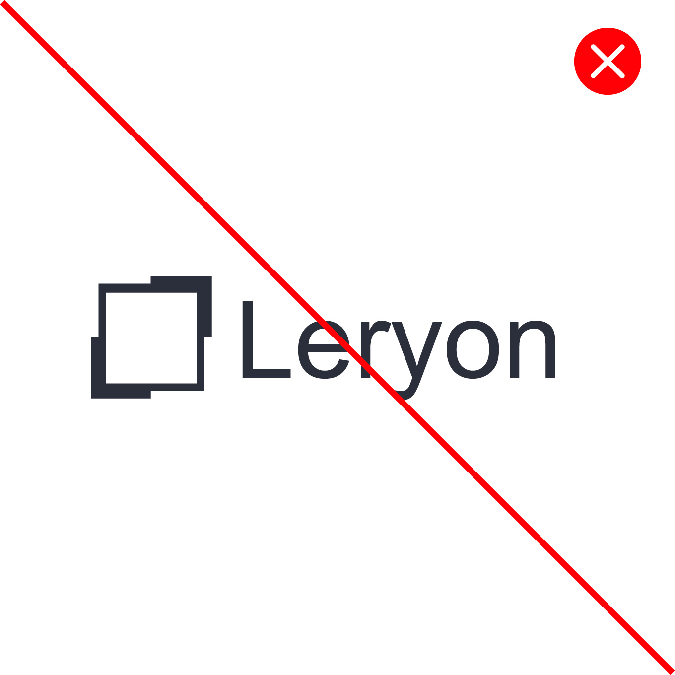
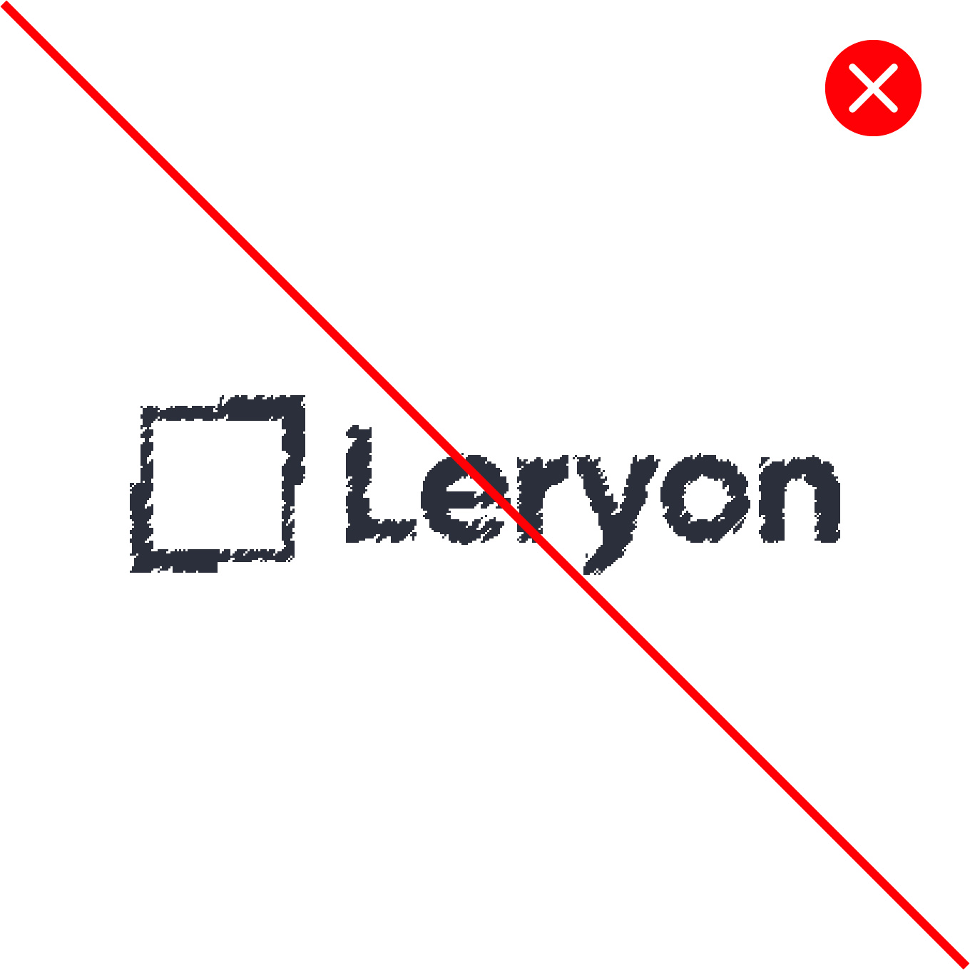
- Change the colors of the brandmark
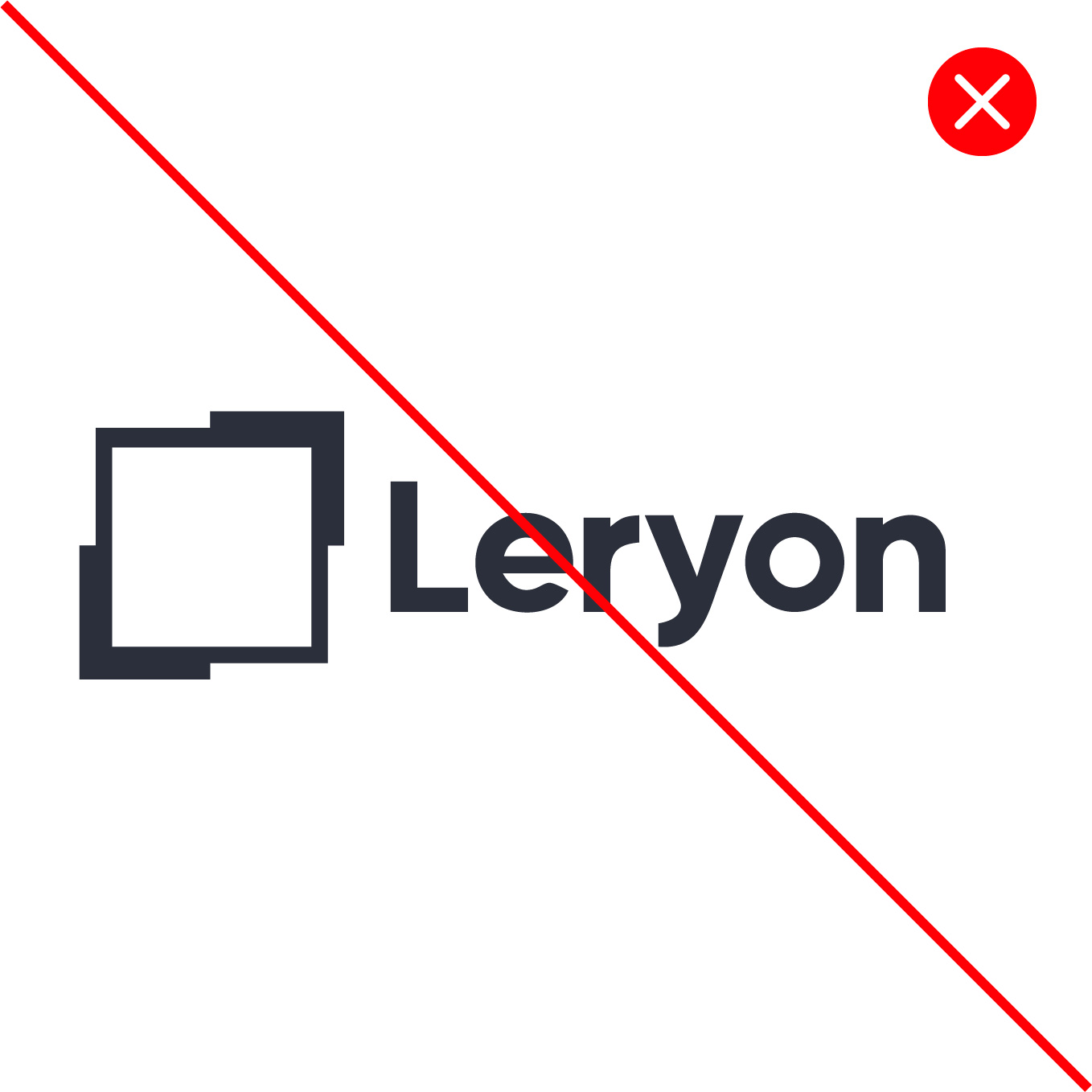
- Change the size of the brandmark
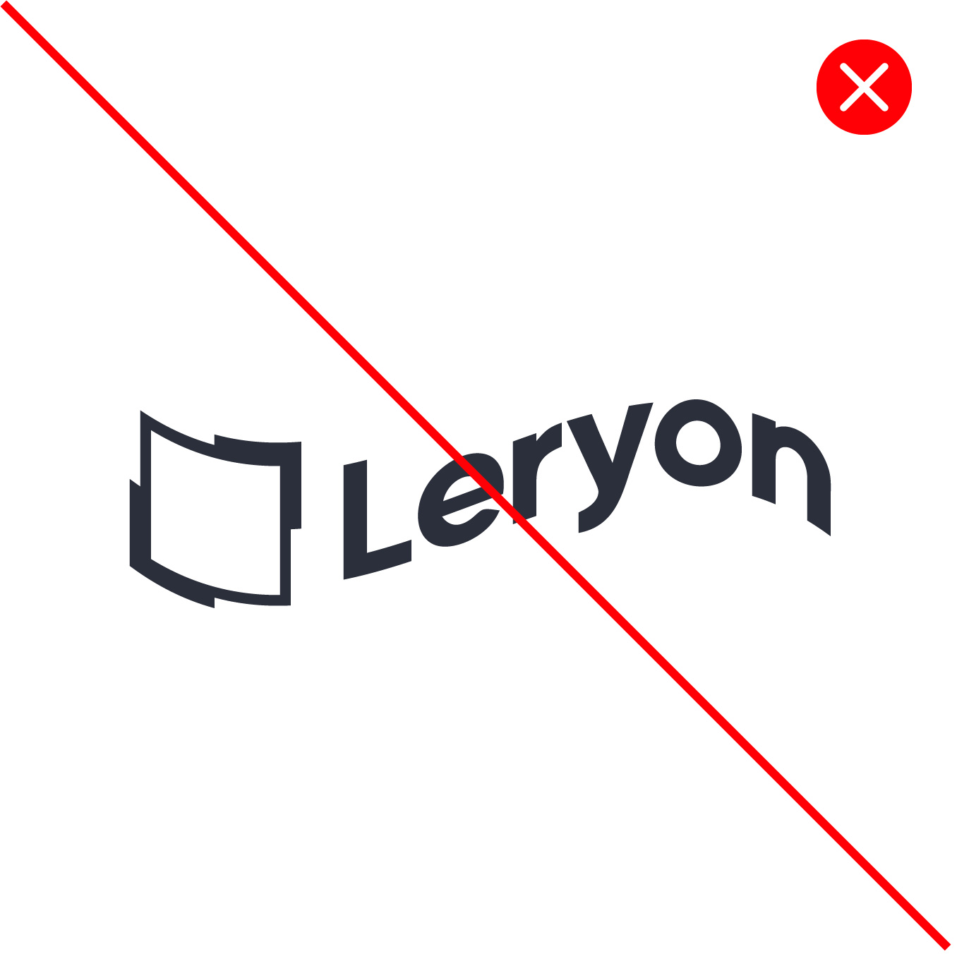
- Change the proportions of the brandmark
